Date
Oct. 19, 2018


Oct. 19, 2018
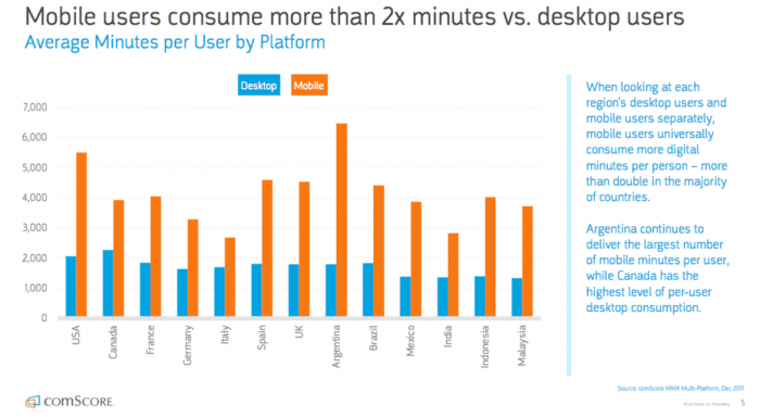
As our world becomes more on-the-go and users seek quick, easy, reliable answers to their questions, keeping up with the demands of today’s consumers is a necessity for any website owner. Mobile users today spend 2x more minutes on their mobiles than they do on their desktops, and that number is expected to grow even more.
Prior to this update, Google’s crawling, indexing, and ranking systems used the desktop version of a page’s content to determine its position in the Search Engine Results Page. This caused issues for mobile searchers when a website’s desktop version was vastly different from the mobile version.
Mobile-first indexing means that Google will use the mobile version of a website for indexing and ranking to better help their primarily mobile users find what they’re looking for. However, this does not mean that Google will only index the mobile version of a website.
Google will look for the mobile version of a website FIRST. If a website does not have a mobile version, then their desktop version will be used for indexing and ranking. However, this will negatively impact your rankings.
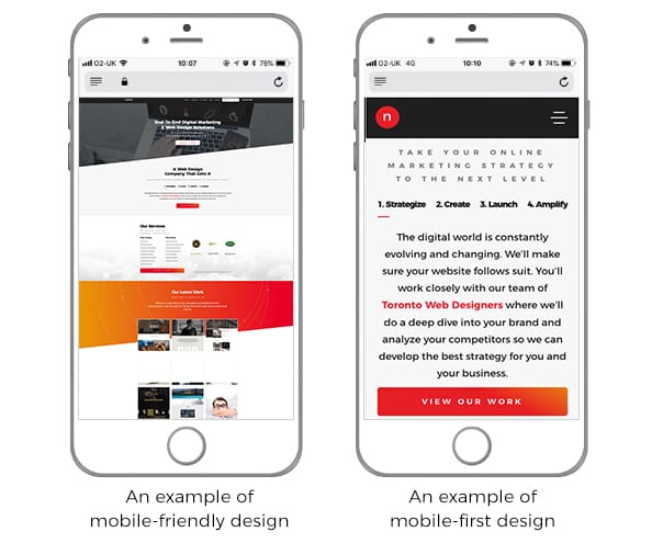
A mobile-friendly website is one that is designed to work the exact same way across all devices. This means that elements do not change according to the size of the screen which can render them completely unusable. Key features such as menus, navigation items, buttons, and text become small and difficult to use on mobile. With no concern for usability, the website becomes incredibly hard to navigate.
Mobile-first design focuses on optimizing the mobile experience first and then adapting the layout so that it can also be viewed neatly on tablet and desktop devices without too many modifications. The design and layout are based on providing excellent mobile user-experience: fast download speeds, easy navigation, and rich media content to keep users interested and ultimately provide the best mobile experience.
Mobile-first indexing means Google will predominantly use the mobile version of a website for indexing and ranking. Because of this, it’s important for website owners to follow best practices and be prepared to give users an optimized mobile experience. Factors such as loading speed, text size, and the size of clickable elements all play crucial roles in creating the best environment for a user.
Is your mobile site slow? Is it hard to read? Do you have to zoom in to click a button? If yes, then it may be time to update your website. More and more mobile users sign online every day and they’re growing increasingly demanding for speedy answers at the tip of their fingers.
If you’re worried about the mobile experience of your site, feel free to contact us and one of our in-house SEO Specialists will be happy to help you.

Book with us
Warning: Working with our team may result in excessive creativity, uncontrollable 'aha' moments, and an addiction to perfect pixels. Please proceed with caution.
