Date
Apr. 12, 2014


Apr. 12, 2014
This easy trick will help you with your web development process and add unique elements to your images.
I’ve added some columns here which are using % based widths just to showcase that your images and shadows can be fluid and responsive.
We then just wrap our images in a div which is going to be the element we target with our shadow CSS effects.
[codepen_embed height=”529″ theme_id=”0″ slug_hash=”lBKEy” default_tab=”html”]
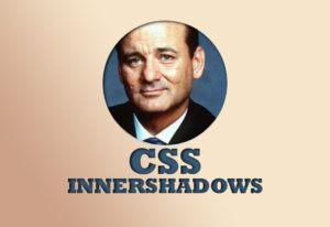
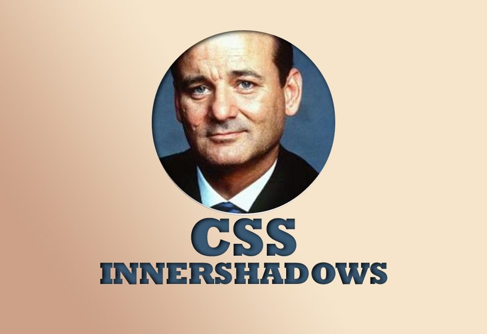
Feel free to change the border-radius on the image and shadow CSS classes… as long as they are both equal to one another. In our example, we’ve made them 50% to give a circle shape to our image and inner shadow.
By setting both our shadow and image elements to relative positions, this allows us to set the image element with a z-index of -1 which allows the shadow layer to sit atop of our image element.
We then add our box-shadow properties and ensure we add the inset to our values for the desired effect 🙂
I’ve also added a CSS transition hover effect for good measure 🙂
[codepen_embed height=”855″ theme_id=”0″ slug_hash=”lBKEy” default_tab=”css”]

Book with us
Warning: Working with our team may result in excessive creativity, uncontrollable 'aha' moments, and an addiction to perfect pixels. Please proceed with caution.