Date
May. 16, 2014


May. 16, 2014
Hindsight is 20/20 and no industry sees this more than the website design sector, trust me, I deal with this every day. As a professional in my field, I regularly deal with clients who have a very particular visual direction they’d like to take, or on the flip side have a vision which they can’t quite articulate. Unbeknownst to them, however, more often than not they haven’t taken the time to understand or appreciate (to no fault of their own) the full picture and the negative impacts certain design and development decisions may have on their long term sustainability.
Hold your horses, it’s not the end of the world! Not everything planned or thought of has gone in vain, that’s why organizations like nvision are here. Being in this industry nearly 15 years now (CRAZY TIMES!!) I’m a huge believer that it’s the responsibility of designers, developers, and marketing strategists to justify a particular design angle, a marketing message or specific tool integration. Truth be told, it’s hard to create the perfect website, the industry is always evolving, new features and technologies are pushing the limits and capabilities regularly, however with proper planning and execution you’ll at least be on the right track to give yourself the best chance to succeed.
Navigation should be a priority. The rule of thumb here is to BE PREDICTABLE. Let your creativity shine in other areas, but give consumers what they expect in terms of navigation. The horizontal top bar navigation is the most widely accepted industry standard, rather than the vertical sidebar. Use icons to help people follow along easier, they’re an amazing resource that seem to be under-utilized. To be able to associate literature with an image will be recalled by your clients much more effectively than having them try to remember where they need to go. Remember, the longer your readers stay on your site, clicking around, the higher the probability of converting that visitor into a lead or a sale.
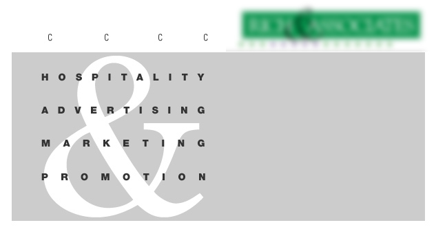
The links in this example are not clear. Where do you click? What links and what doesn’t?
![]()
Our example, although cropped here, shows 3 distinctive navigational links to Shop Online, How it Works, and Success Stories. These are clear, noticeable and easy to find.
Descriptions are nifty, but what is it exactly that you want people to do? Do you want people to sign up for a newsletter, peruse your online store, contact you for a free quote, download a report, “Like” you on Facebook, or take advantage of a special promotion? Be bold and create a call-to-action button that can’t be missed. Additionally, you’re not limited to 1 call-to-action, you can have multiple CTA’s throughout your homepage or website, here’s a great example of great CTA utilization on the http://www.simply-bbq.com website.
This example offers no distinct incentive to click anywhere.
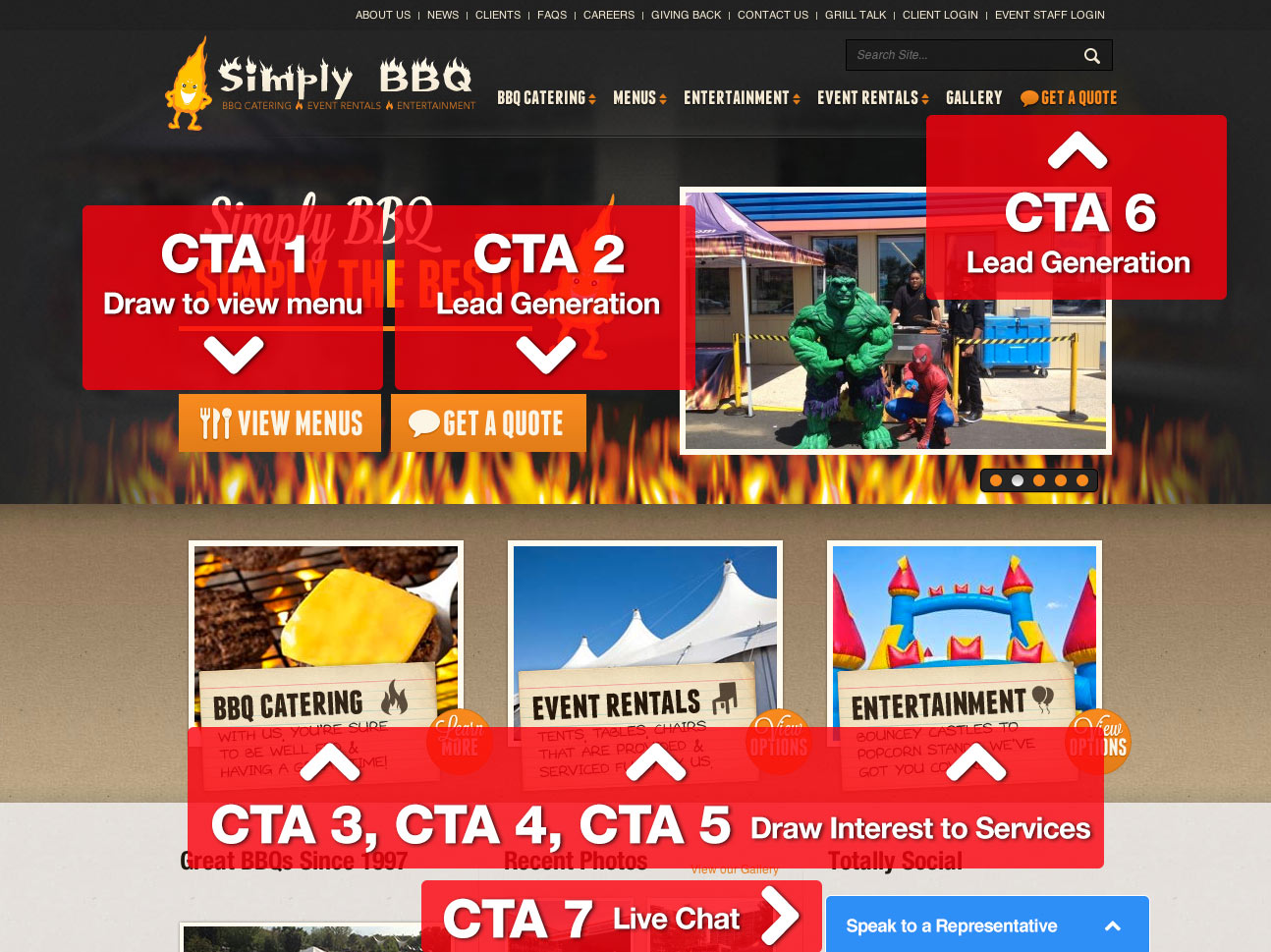
Simply BBQ’s clear calls to action are highlighted by big blocky buttons and colour separation.
You can have the best copywriter on the planet (we’ve got one… Whoooo!), but if your content isn’t arranged in a visually pleasing and easy-to-scan manner then you’re almost guaranteed to lose your audience. Most people don’t read every word you put on the page, so it’s a good idea to provide enough white space to focus readers, break up the text into digestible blocks using headlines and bulleted lists, choose a pleasing font that is large enough to read (but not too large), and make sure there are no errors in your spelling or grammar, I can’t believe the kind of stuff I find from “pros.”
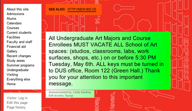
Oh boy, this example is not easy on the eyes. No padding + no content separation = no one reading.
Simplify, simplify, simplify! You don’t want too many words, too many images or too many ads on a page. There seems to be a lot of misunderstanding in the industry with respect to how much content a particular a page on a website should have, the answer is to have a balance, you don’t need 1000 words on your homepage for SEO to work, find the balance and make the page make sense. Try to have the most important information at the top of the screen and give readers what they are searching for. Everything else can wait.
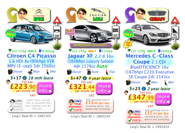
Although quite hilarious, this example is full of clutter! Your eye isn’t drawn to anything in particular, as everything about this is loud and fighting for your attention. When everything stands out, nothing stands out.
In our example, the content is clean, broken up and has a hierarchy and the user can easily digest the content.


Let’s accomplish what you are looking for, our team of experts are here for you.
Let's work togetherWarning: Working with our team may result in excessive creativity, uncontrollable 'aha' moments, and an addiction to perfect pixels. Please proceed with caution.