Jan. 12, 2018

Top Web Design Trends for 2018
To stay on top of the trends seems to be impossible in the rapidly changing web world, web design is so dynamic that it can be difficult to predict. What was popular yesterday doesn’t seem to be the same today. Therefore, it’s imperative to continuously monitor changing web design trends and adapt with the clients needs in mind. At nvision we do just that by working very closely with our clients and taking into account the latest web design trends for an absolutely memorable and result driven website. Here are our predictions for the top web design trends for 2018:
Flat Design 2.0
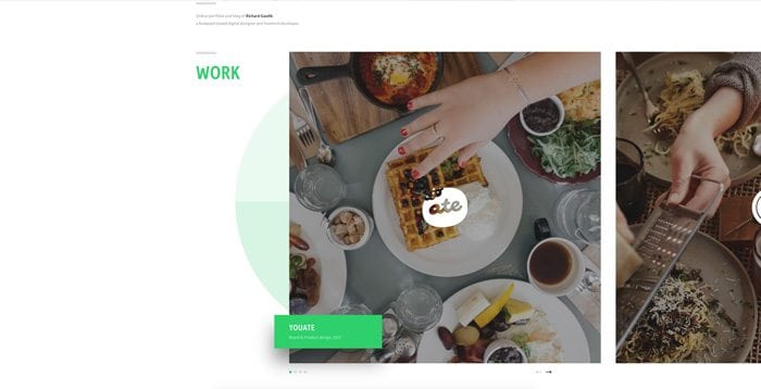 Flat design has been a popular web design trend we’ve seen in recent years. Clean and simple websites for better performance and usability. And when designs perform better, it’s also a plus for search engines to consider for ranking. Your website will rank higher if it performs well which in turn means it has a better chance of converting. The biggest issue when designing flat is being able to differentiate between static and clickable content. Designers have begun to recognize this issue and as a result Flat Design 2.0 has emerged. Using shadows and gradients among other techniques to help give the necessary cues.
Focus on Typography
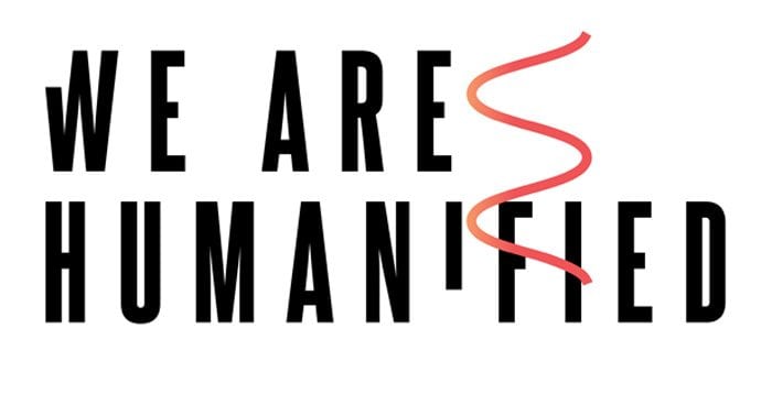
You know the old saying a picture is worth a thousand words. In 2018 it’s the opposite. Regardless of whether we want it or not typography has the ability to evoke a mood or feeling and tell a story. This is why companies will pay big bucks to develop their own signature font. We are already seeing typography being used as a backdrop in web design. In 2018, we foresee typography replacing images entirely in some instances.
Greater Use of Negative Space
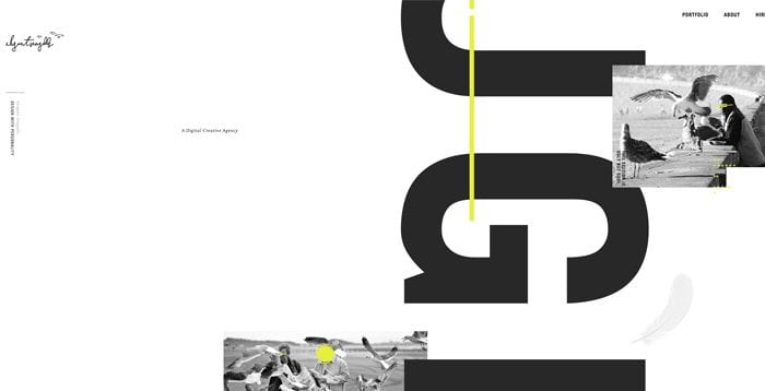
Design is very result driven in 2018. Everything on the page is there for one reason. Increase conversions. The goal is to help users quickly and easily identify certain actions or messages. Reducing fluff and distractions helps draw the users attention to the point of engagement or conversion. Minimalism continues to evolve every year and it will be no different in 2018 for this web design trend.
Bottom Sticky Elements vs. Top Sticky Elements
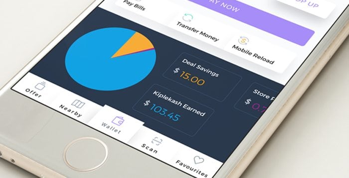
With mobile use continuing to grow in 2017. People are getting use to clicking the bottom of their screens which is why we are starting to see sticky menu items scroll from the bottom of sites, instead of the top. Mobile apps are also a huge component of this web design trend.
Vibrant Colours
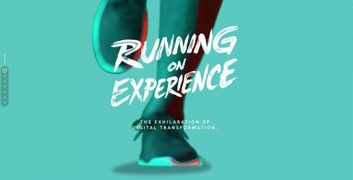
Colour is a large part of any design. Just like typography it has the ability to set the whole feel of your website or app design and it is even more important for accessibility reasons. Adobe Color CC or Material Design are some of my favourites and provide a good starting point and guide for choosing colours.
Is Your Website Ready for 2018?
With so many new and emerging web design trends it was hard to narrow down to only 5. What trends would you add to the list or be interested in learning more about? Between vibrant colours, bold gradients and typography; 2018 should be an exciting year for the web. If your website is outdated or not performing the way you would like, our team of skilled professionals can help.
Book with us
Let’s accomplish what you are looking for, our team of experts are here for you.
Let's work togetherWarning: Working with our team may result in excessive creativity, uncontrollable 'aha' moments, and an addiction to perfect pixels. Please proceed with caution.
