May. 29, 2018

5 Crucial Elements Your Website is Missing
Your website is the virtual face of your company and is most often crucial to its consistent success. It can bring traffic to your goods and services, establish connections, develop loyalty, inform, people and businesses, and provides opportunities for conversion. With that being said, there are crucial website elements to consider that should not be missing from your website in order to provide the best user experience.
Crucial elements that every website should not be missing
We hope that this will guide you to review and keep an eye out for certain crucial elements of a website that performs effectively and give the best user experience.
1. Responsive Design
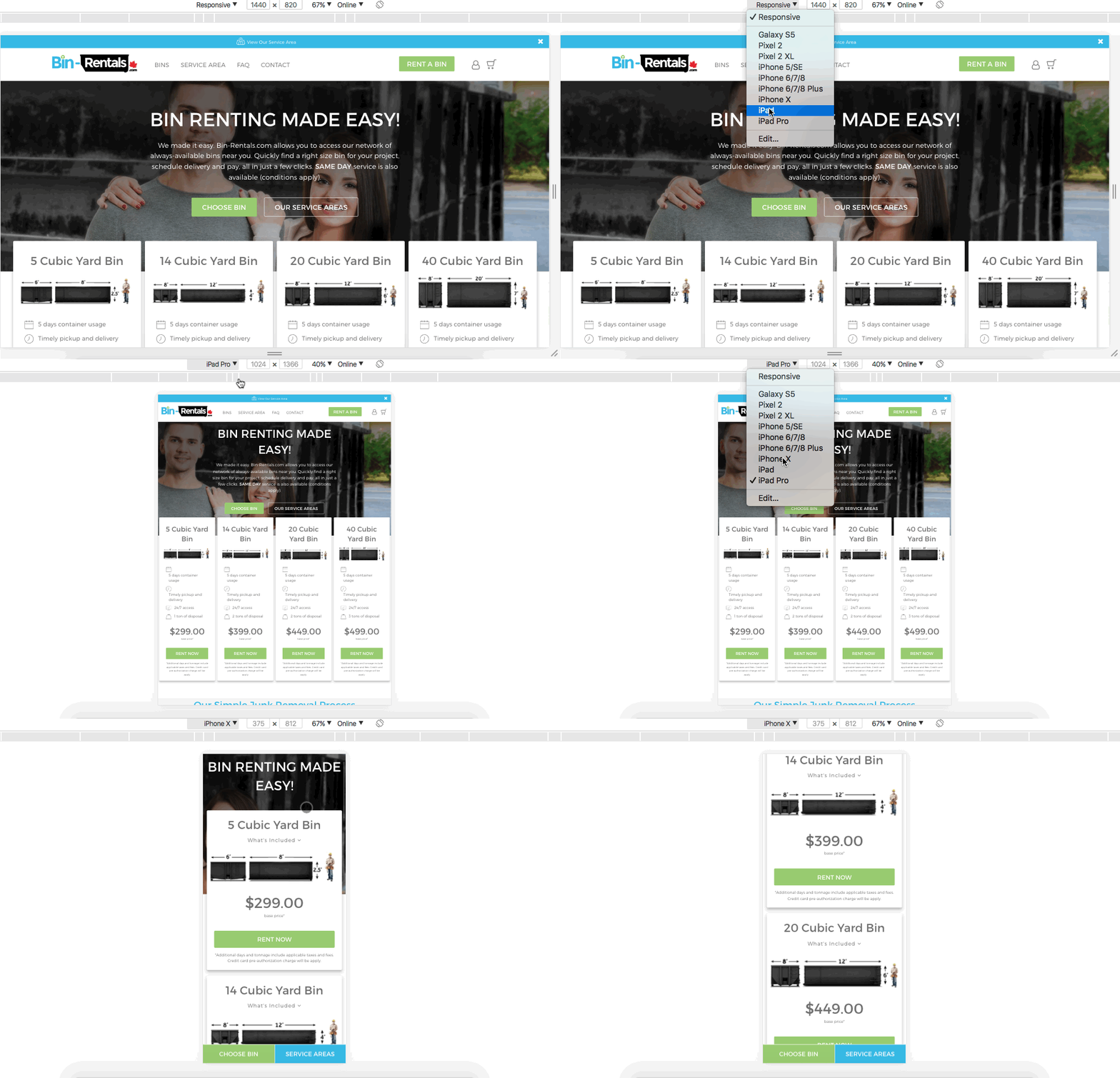
Responsive design requires you to have a website that is coded and designed in a certain way so that it is optimized on basically any possible device and screen size. According to Statista, 52.2% of all website traffic worldwide has been generated through mobile phones in 2018 so far.

The an example above is of a website we have recently launched for Bin-Rentals.com that has been optimized for responsive design.
This is crucial, and can literally impact the growth of any business that requires a website in order to develop and has a large impact on bounce rates if not considered.
How can I tell if my website is mobile friendly?
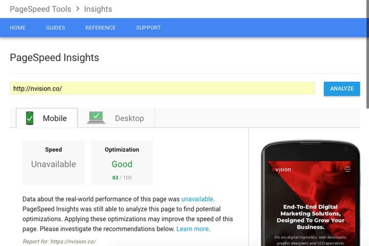
It’s not just about how a website visually looks on a smaller screen. The following websites provide clear insight on whether or not your website is mobile friendly with reports and details on how to fix any issues. The first step is simply input your url to test your website and it will be thoroughly analyzed.

Google Mobile Friendly test tool
One of the most instant and easily recognizable disturbances when it comes to user experience. This is #1 on the list for a reason, friends!
2. Website Navigation
When landing on your website, a user can potentially have a clear goal or develop one while exploring your website. They might want to view your services, explore pricing options, find your contact information, read more blog posts, etc. Finding a clear way to navigate towards these goals should be a smooth process.
A user does not want to feel that they have to put in too much effort when it comes to going through your website. It gives off the a vibe of being disorganized and can be very frustrating.
3. Clear call-to-actions
A call-to-action is the opportunity for you to have an exchange with the user. As soon as a user lands on your website, they should feel compelled to perform a relevant action. This will be one of the greatest potentials for leads to generating traffic for your site.

Your message, service, contact information must be present in exchange of some type of offer such as contacting you, purchasing a product, service, signing up for a newsletter, etc.
You can communicate your message all you want, but if a user doesn’t have a clear opportunity to convert, and connect with you, it is a huge opportunity missed.
4. Testimonials
Testimonials capture a lot of attention for various reasons. Large or small business, testimonials play an important role in the strategy behind increasing the credibility of your site, especially when involved in offering services and products for purchase.
When a positive message from a satisfied customer and not just yourself is available, it will make your message clear and persuading for converting new users.
Common questions that users will have in the hopes that testimonials could answer:
- Is this product/service worth the investment?
- How is customer service in case I need it?
- Have other businesses worked with you and leave on a positive note?
Don’t have testimonials or reviews?
Ask your past clients or customers who have had the pleasure of doing business with you. This gives you the opportunity to reconnect with your clients and develop relationships. This can be the opportunity to hear honest thoughts about what went both right and wrong, which in return gives you further insight on developing your business.
5. Social Media Links
As social media continues to grow, it has proven to be one of the most popular and easily accessible forms of communication. Adding social links actually helps increase the chance that users will find your website when your name is inputted in a search engine.
Both social media and your website work together in driving traffic to and from each other. It gives the user a glimpse into your online presence
Where to put social links
They should be available and easy for users to find if needed. On the top or bottom of your homepage, where a user can find them quickly and easily. It is also critical that these social links open up in a new tab, so as not to bounce the user off your site.

We hope that that the list above has provided some insight and assists your website in achieving its goals as the digital face of your company! If your website is currently lacking any of these elements to fix that, feel free to get in touch with us. Or leave a comment below to find out further information on providing your customers with the best user experience.
Book with us
Let’s accomplish what you are looking for, our team of experts are here for you.
Let's work togetherWarning: Working with our team may result in excessive creativity, uncontrollable 'aha' moments, and an addiction to perfect pixels. Please proceed with caution.


