Date
Jan. 24, 2014


Jan. 24, 2014
So, if you’re part of the 56% of the people on this planet (According to DigitalBuzz) that have a smartphone, then you know how annoying it is to pinch, zoom, tilt and la Bamba with your mobile device. These days it’s practically essential to go responsive web design to adhere and accommodate your site’s visitors.
So what is responsive web design you ask? In a nutshell, responsive design is essentially accommodating a variety of device resolutions (smartphones, tablets, desktop’s even TV’s) the best user experience possible. So what in the world is user experience, and why do I need experience with a website you might ask? UX as we like to call it is the heart and soul of this approach, this is where some of the fat gets trimmed or tucked so to speak, so we can present the end user with the most relevant and the highest of priority content possible based on what device they’re on.
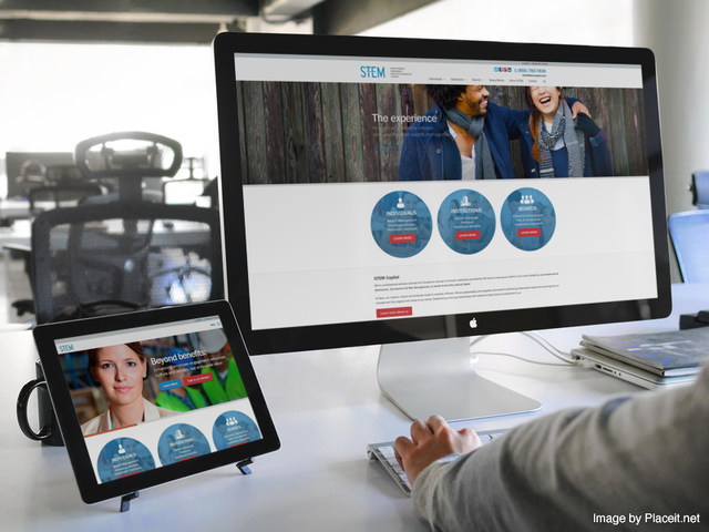
Responsive is your website conforming to the various devices screen sizes. So if you were to look at your website on an iPhone, a Samsung Galaxy or a tablet-based device, the site would look like it was meant to be on that device without giving your fingers a jazzercise lesson.
More and more of us are spending time exclusively on our smartphones or tablets, heck, if I didn’t need to write the rare line of code, or use some of my graphically intensive applications, I’d likely never have the need for a Laptop or Desktop device.
Presumably in the future with more convenient typing devices like CTX’s VK200 or text to speech applications, there’s no end in sight for how much time we’ll be spending on mobile, this includes for arguments sake, Google’s Glass technology or Mobile watches, which the jury (I think) is still out on.
So what are some of the obvious reasons everyone should consider going Responsive?
Imagine walking into a retail store and then having to scale a brick wall, and then doing a cage crawl in order to purchase a pair of flip-flops, not pleasant. Make your web experience pleasant, clients aren’t willing to put in the effort! NO MATTER what device, your site will RESPOND big, small, short or tall like Dr.Seuss
Some additional reference which you might want to consider:
Cool article on some great responsive tools:
Next Up, Retina, what the heck does that mean?

Book with us
Warning: Working with our team may result in excessive creativity, uncontrollable 'aha' moments, and an addiction to perfect pixels. Please proceed with caution.