May. 6, 2015

How you Can Design a Facebook Cover Photo
Spice up your brand’s potential with some helpful tips that ensure your facebook cover gets the proper response. Facebook currently holds the trophy for the #1 social networking website with more than a billion of monthly active users with 4.75 billion shares each day.
Designing a proper cover photo is extremely important. It represents a brand’s Facebook page as the first thing that people see as soon as they land on it with the potential to hold a good amount of information depending on what you want to display.
This post features examples of cover photos that I have made in the past as guides and examples for you as the client or the designer.
Basic overview of the size and blind spots
Facebook cover photos are 851 × 315 px in size.
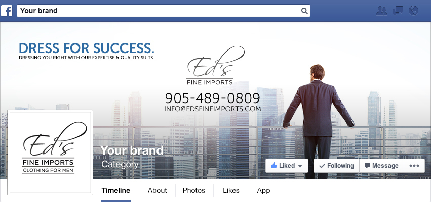
This cover photo below was made to generally advertise the brand and how it specializes in men’s’ suits and sophisticated quality.
In terms of blind spots, you can see above that certain parts of your photo will inevitably be blocked by your profile picture, brand title, and various buttons unless the cover photo is actually clicked on.
Another thing to note is that Facebook automatically adds a dark gradient at the bottom of your cover when it isn’t clicked on to ensure that the name and other text in white can be seen clearly.
You don’t have a lot of space to work within an FB cover photo so certain elements and visuals must be prioritized for display.
The display above shows the same cover photo except it has areas highlighted in which you should be aware of when putting together your cover. Keep the information minimum in these spots, you don’t want to rely on a person to click on your cover in order to fully understand it.
Choose what you want to display
Keep it relevant, get your point across. Is the cover here for a specific season? New product or releases? Promoting a contest? The visual hierarchy will center around this particular feature i.e. the colours you choose and how you arrange headlines/subheads.
Keep it updated. If you’re advertising a product in your cover that is limited edition and no longer available, you don’t want to wait days later to change it and mislead your customers.
In most cases the safest elements to add would be:
- an image
- headline
- tagline or subhead
- and/or some smaller elements like website URL.
There are of course no specific rules and regulations but this ensures that you avoid clutter and the user’s confusion.
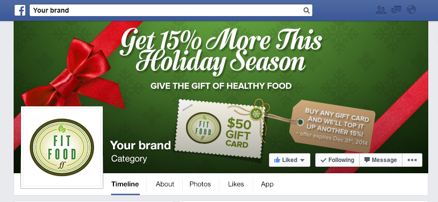
Here is a holiday cover that I made for Fitfood to display their Christmas deal placed in another facebook mockup.
This is a good example of a seasonal cover. With a large amount of information on it yet it is clear and straight to the point.
To break it down:
- Legibility: a bold headline that can be read clearly even at a relatively far distance from your screen
- Visual hierarchy: the viewer will be able to read each line in an order. Depending on the weight and placement of subheads and image of card/tag.
- Colours relate to Christmas to help convey that there is a holiday deal
- No text or important element is being covered by the profile picture or buttons
- A lot of information calls for a minimalistic background that won’t distract the eyes from the text
- Visually appealing to retain attention. (follow these guidelines but don’t forget to make sure your cover is pleasing to the eye!)
After you’ve designed your cover
Before uploading the cover or presenting it to the client. Be sure to put yourself in a viewer’s place. Looking at your cover for the first time to see how you would react. As well as ask others for feedback on it.
Book with us
Let’s accomplish what you are looking for, our team of experts are here for you.
Let's work togetherWarning: Working with our team may result in excessive creativity, uncontrollable 'aha' moments, and an addiction to perfect pixels. Please proceed with caution.


