Feb. 23, 2018

Bridging the Gap From Good Web Design to Good Website
At first glance, the two concepts seem synonymous. If you have a good web design, you assume you have a good website and have everything you need to anchor your digital marketing strategy. In reality, though, that statement is far from the truth.
Don’t get me wrong; beautiful web design matters in improving your online presence. But it’s only a small piece of the puzzle. If your goal is to make sure that your website actually attracts and converts, you need more than just good design, MUCH MORE!
Your Website, From a User’s Perspective
The days when a business website could simply function as a digital billboard are over. Today, your online presence has become much more. It is the central way in which your potential customers inform themselves about your products, services, and values.
What I mean by that is that your online presence is no longer a one-way conversation. Instead, your visitors want to know about your company as well as its position in the market place. They want to ask questions, get engaged, and take steps toward becoming customers. In other words, they use your website as a tool to inform their entire buyer’s journey.

The Importance of Good Web Design
Within the context of your user journey (UJ), good web design is crucial. Given 15 minutes to consume content, the clear majority of users prefer the more well-designed option. When the content is not attractive, almost half of your audience stops engaging entirely.
Colors, layout, and other web design elements clearly matter to attract and engage your audience. But they cannot be the only variable determining the success or failure of your online presence. I still believe that good web design is a core function and requirement of any successful digital strategy. But I also know that to achieve sustainable success, you have to go beyond just design.
5 Steps to Take Your Website Beyond Good Web Design
Good design attracts and engages your audience. But how do you make sure that engagement actually translates to increased revenue? Conversions are the key to success. To get there, all it takes is five steps. Use them to rebuild your website into a strategic funnel that moves your visitors to become leads and customers.
1) Understand Your User Journey
First, you need to do the research. If you don’t know exactly how your users behave, you can’t actually optimize your site for that behaviour. If you cannot do that, how are you supposed to influence it toward your desired action points? Also, if you have not clue where they’re coming from, that’s also is a major problem.
I’ve found that a number of tactics can help you better understand your audience from the moment they visit. Heat mapping helps you understand where their eyes move, which is where your most important messages should live. Exit points let you know where your audience tends to lose interest while browsing your site.
 Of course, these are just a couple of the many data points you can use to better understand your user journey. Anything from bounce rate to average time on page is vital to help you understand visitor behavior. It allows you to optimize your website according to your most important marketing and conversion goals.
2) Maximize Entry Point Effectiveness
Just where do most users actually enter your website? Your home page is an obvious, but not always the right answer. That’s especially true if you are running digital campaigns or an SEO-optimized blog. Now, users first learn about you through a landing page with more specific conversion opportunities.
Your goal should be to not just find these most common entry points, but maximize their effectiveness. As visitors first learn about you, try to understand the information they are most looking to gain. Providing that information should be your baseline for success, but it also makes sense to go beyond. For instance, a campaign landing page might benefit from a testimonial that adds third-party credibility to your messaging.
3) Optimize Your Content
The content of your website also plays a crucial part in driving your visitors down your sales funnel. Even the most beautiful website will fail if its content lacks in quality, authenticity, readability, or focus.
I usually take a number of steps to optimize web content. First, understand exactly what your audience’s pain points are, and answer them thoroughly. Second, break up long paragraphs into shorter sentences and lists, separating them through subheaders. Search engine optimization is another vital part of enhancing your web content.
Not all content is text. In fact, strategically adding visuals can significantly improve your users’ website experience. Videos, images, and graphics should all play a role on your most important conversion pages. Adding video testimonials or an infographic to a landing page enhances your content in a way that straightforward text cannot. Here’s a great blog on how you can actually get people to read what you’re writing.
Still with me?

4) Get Your Technical Structure Right
Beyond research and the content itself, your website’s backend structure also needs to be just right and tight! A beautiful design that takes 10 seconds to load or is not mobile-friendly is insufficient. Every additional second of page load time can reduce your revenue by significant amounts.
Getting the structure right also means optimizing your navigation. That navigation needs to be intuitive, naturally pointing your audience toward the content they’re looking for. A search bar can further improve your user experience, especially with a filter option in e-commerce contexts.
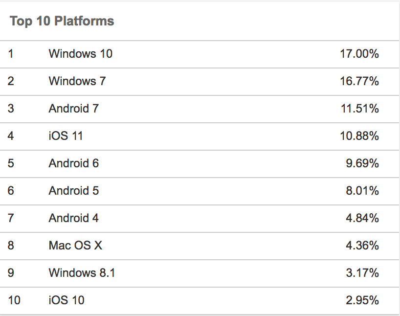
Finally, be careful not to build a website only works on desktop devices or vice versa. We’re currently close to a 50/50 split between mobile and desktop users, and that balance will continue to shift. That’s why you need a responsive design and content that functions equally well regardless of screen size. Checkout the latest stats from January 2018 at W3Counter.

5) Drive Toward Conversions
Finally, when building your website, I implore you to make the conversion points obvious, SCREAM THEM OUT! Almost half your visitors leave your website if they don’t have an easy way to contact you, find you or checkout. Dynamic, optimized contact forms and clear calls to action can change that. They don’t just attract potential customers, but actually drive them toward conversions.
Conversion optimization on your website is a topic so extensive that deserves its own long-form treatment. But the core concept is clear. Make conversions obvious, and your visitors will become more likely to actually take you up on that next step.

Getting Started in Moving from Web Design to Web Improvement
No one will hear me say that web design doesn’t matter for your online presence. Instead, I’m saying that it should act as the baseline rather than the central focal point of your website. Good web design without the right approach accommodate your users’ experience does not result in conversions or customer growth.
How can you integrate good web design with a great structure and the other elements required to maximize its potential? To get to that point, you might need help.
At nvision, we specialize in a holistic website build process. We don’t neglect design, but optimize your website for your user expectations and experience. Partner with us, and we can drive your online presence in that direction. Contact us for more information about a potential partnerships, along with other tips on how to optimize your website.
If you enjoyed this read, check out a couple other relevant posts below.
Book with us
Let’s accomplish what you are looking for, our team of experts are here for you.
Let's work togetherWarning: Working with our team may result in excessive creativity, uncontrollable 'aha' moments, and an addiction to perfect pixels. Please proceed with caution.


