Oct. 21, 2016

Google’s Mobile First Indexing Shift – Are You Ready?
BOOM!!
Well, it just happened.
What a lot of us have been speculating and expecting to some degree, and warning clients, Google has finally drawn a line in the sand by announcing their shift to focus on a better mobile experience.
At Pubcon 2016, Gary Illyes, Webmaster Trends Analyst at Google, morning keynote talked about search infrastructure like HTTPS to ranking and spam like RankBrain (machine learning), Penguin (bad link practices), keep using the disavow tool and more.
Keynote: Gary Illyes Pubcon Las Vegas 2016 https://t.co/gbANQEZkgw via @LisaBarone #pubcon pic.twitter.com/je0znjjyls
— Pubcon (@Pubcon) October 13, 2016
But the biggest jaw-dropping moment is the fact that Google will be switching to a mobile-first index. Yup, you read that right. They are essentially dividing the mobile and desktop indexes. This doesn’t mean desktop will disappear (yet) but it will only be updated second to mobile the new primary index this means a few new things for your SEO.
Google will still have a desktop index, it just won’t be as fresh as the mobile index. #pubcon
— Lisa Barone (@LisaBarone) October 13, 2016
The Signs of a Mobile First Indexing
If you think about it, it makes complete sense. With users spending 177 minutes on their smartphones per day looking to answer questions, and in many instances, using verbal commands, it’s no wonder that 85% of Google’s search results are mobile-friendly which led to the mobile-friendly label being dropped from mobile searches.
Up to now, Google would crawl your desktop website and try to find a happy balance between desktop and mobile by awarding sites that were either dedicated to mobile or sites built with responsive/adaptive versions. But if you read the writing on the wall (aka search algorithm), there have been a boatload of signs of change coming.
Take for example the past few mobile algorithm updates to improve search result and give love to mobile first pages. Plus, check out the updates since early-mid September from Google Webmaster Central blog on Accelerate Mobile Pages (AMP) – a way to build mobile web pages for static content to render faster:
• How to get started with Accelerated Mobile Pages
• How can Google Search Console help you AMPlify your site
• How to best evaluate issues with your Accelerated Mobile Pages
• Top 8 things to consider when you AMPlify a site
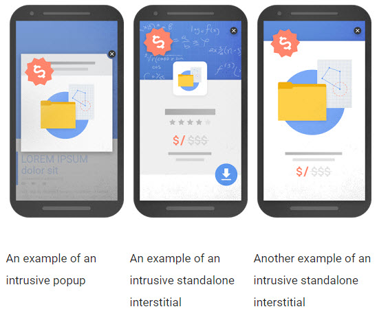
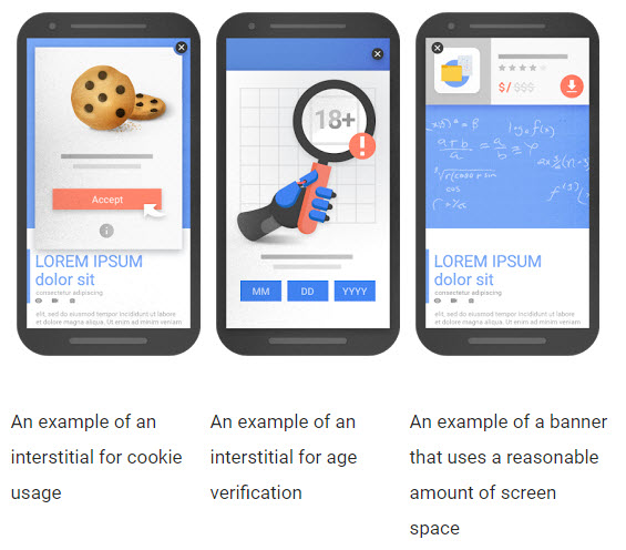
As well, in the same breath that Google dropped the mobile-friendly label, they also mentioned that as of January 10, 2017, not easily accessible content from the transition of mobile search results to a mobile page may not rank as highly.
Google’s examples of inaccessible content
Google’s examples of pages that would not be affected with accessible content
Are you paying attention now? Let’s see how you can start taking steps towards reducing your risk.
So What Does This Mean for Your Business
Get mobile-friendly FAST NOW!!
“Now” really should have been done a year ago, but since splitting the indexes won’t happen for several “months”, there’s still hope.
1. First, test your website’s mobile friendliness
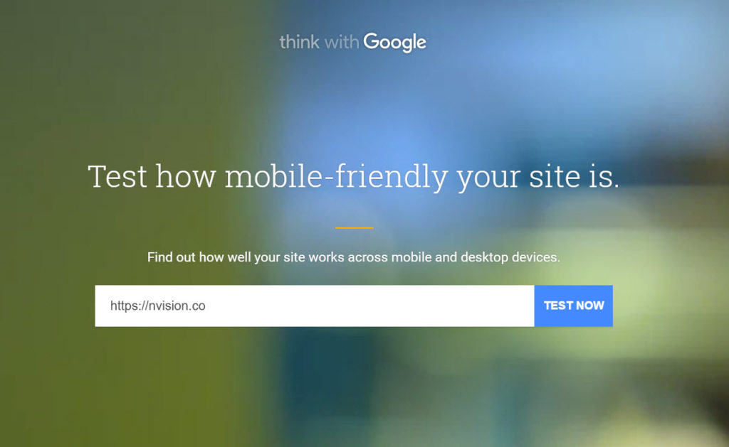
Use Google’s new Mobile Friendly Testing Tool to measures your site’s mobile friendliness, mobile speed and desktop speed. Once done, download the report and take stock of what you need to do.
2. If you have two versions of your website, start re-evaluating both.
These are the ones that will have to act fast because if your sites have different page structures and content on mobile versus desktop, you could be affected negatively. Needless to say, if your mobile-experience is optimized when it comes to page load time, user experience, content, etc., you should be golden.
PRO TIP: Don’t forget about incorporating schema markup. Structured data is more important now than before especially if your site has e-commerce, recipes, reviews, or events.
3. Double check your mobile content
Most people tend to slim down the number of words on mobile pages to improve UX and possibly loading. This is, in fact, untrue as Google relays on page content to determine rankings and that they’re serving the right content to users.
4. Lastly, start considering about adding AMP to your site.
AMP is an open source initiative that prevents reading on mobile to be slow and frustrating.
So let’s recap. Google’s shift to ensuring mobile search results meet user experience started in 2013 and then again in April 2015 (remember Mobilegeddon) and finally in May 2016 with a smaller update effecting individual pages. Which leads us to today. In a few months Google will be splitting their index into desktop and mobile, where mobile is the primary index. This is huge.
With over 50% of searches being done on mobile devices, it’s clear that Google will continue to improve their mobile algorithm which may eventually lead to desktop index becoming obsolete. We’re already seeing websites being built with a mobile first design approach.
During this time we’ll help and keep an eye on further developments and help mitigate any risk you may have by continually re-evaluating updates.
Book with us
Let’s accomplish what you are looking for, our team of experts are here for you.
Let's work togetherWarning: Working with our team may result in excessive creativity, uncontrollable 'aha' moments, and an addiction to perfect pixels. Please proceed with caution.


