Jul. 30, 2018

8 Essential Sections for a High Converting Landing Page
As marketers, we all know the importance of a landing page. It’s a lot more concise than a website, removing all the depth of pages that consumers can easily get lost in. It keeps the focus on one single product, service and ONE call to action. It seems easy enough to just create an isolated webpage… But how do you make a high converting landing page? It’s definitely not by replicating a page already on your site.
Let’s walk though the essential sections of a landing page that show the potential customer everything they need to know before they click the “buy now” or “sign up” buttons.
- Landing Page Hero
- Form Sign-up
- How it Works Section
- Social Proof Logos
- Benefits
- Social Proof Again
- Features
- Call to Action
Let’s break down what these mean and what you should be putting in each section of your landing page.
1. Landing Page Hero
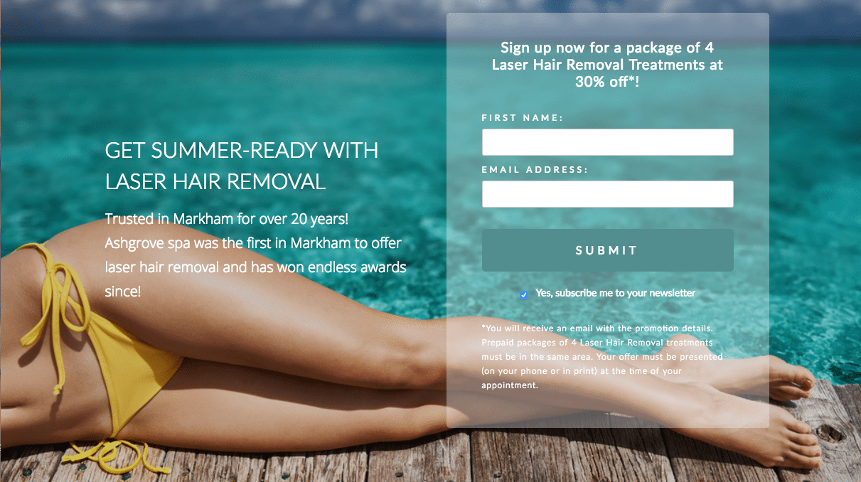
The hero is exactly that, it’s the most important section and can make or break a high converting landing page. Choosing the right image or video to represent what you’re selling is key. And the copy must be on point! Your tagline has to be a concise elevator pitch in under 50 words to communicate exactly why the user should do what you ask of them. Easy right?
2. Form Sign-up
What’s that one major Call To Action for your landing page? Most typically, the purpose of your page will be a form sign-up. If not, replace this with your other Call To Action, whether it’s a direct download, tracked phone number or other. I like to have this section in a column in the hero so that it’s immediately clear what the goal of the page is. See above!
3. How it Works Section
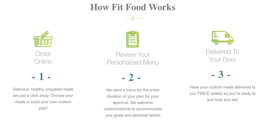
No matter how simple or complex your product or service is, figure out how to break it down into 3 or 4 steps to describe “How it Works”. If you’re selling a complicated product on eCommerce, use this section to describe how your product works. But if you have a more complex ordering or delivery system, maybe explain the process of shopping for your product. It should be a simple visualization of the process of working with your brand from start to finish!
4. Social Proof Logos
It’s totally non-negotiable that you need to show the user that you’re worthy of their trust. In the wide world of the internet, and particularly if you’re using ads as your funnel to get click-throughs, sometimes people land on spammy pages. Consumers are savvy to that and have a low tolerance for fraudulent sites. So in order to build that credibility, you have to send the right trust signals. A high converting landing page will always show how they’re legit. So having a section of recognizable logos will always help show who you can be associated with. These can come in many forms:
- Logos from notable press features
- Awards badges that your business has won
- Renowned brands that your business carries
- Logos of secure payment methods you accept
- Badges from testimonial sites where you have high ratings
5. Benefits (not features!)
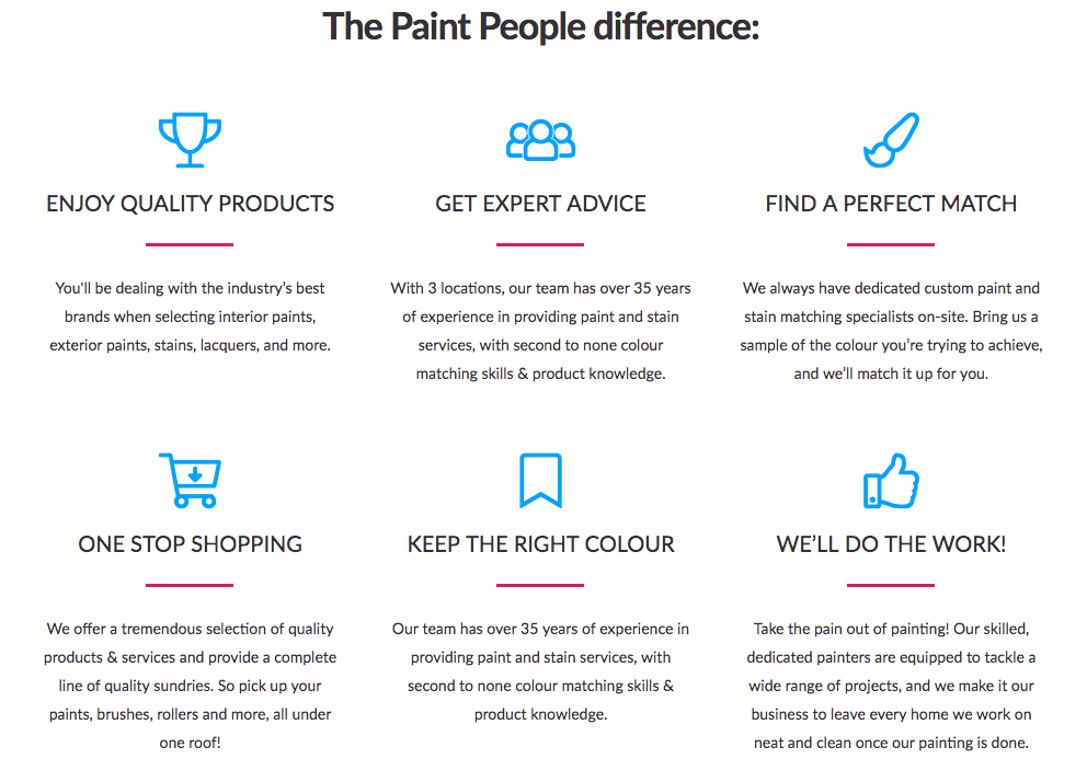
Use an entire section to simply list the benefits (and NOT features) of your product or service. What’s the difference? When you’re writing this section, put yourself in the shoes of the customer and ask “How does this help me? How will it make my life easier, better or simpler?”.
A great example of positioning a feature as a benefit is when you’re selling a cell phone’s battery capacity.
Feature = This Cell Phone has 2000 mAh battery
Benefit = Use your phone without any worries. You won’t have to charge your phone for a full day!
So instead of listing out all those internal terms, jargon and technical stats, give it a bit of a spin so your customer understands how it benefits them.
6. Social Proof Again
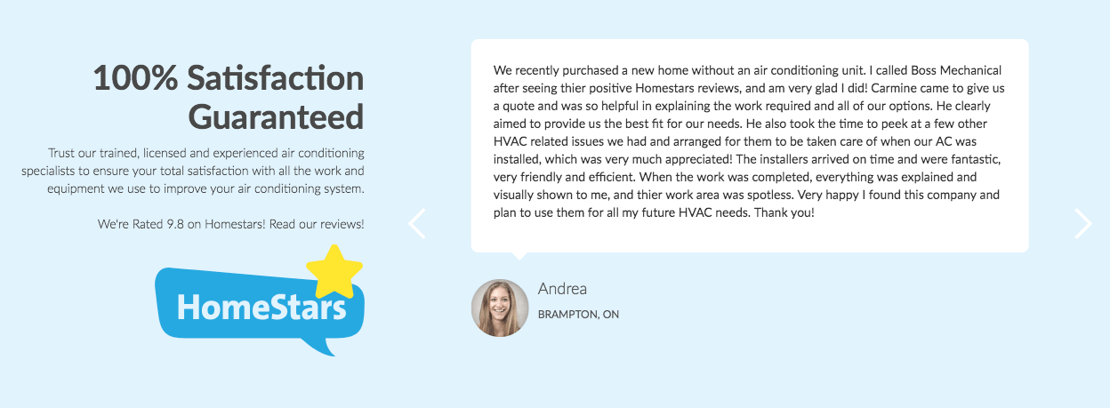
Did I already mention that you have to build the users’ trust? Well you do, and it doesn’t ever hurt to add more trust signals. With the saturation of every market, the amount of information constantly available, and just too many choices, people are always going to trust other real people. 88% of consumers trust online reviews as much as personal recommendations. It’s like digital word of mouth influencing. When a site has customer reviews, 63% are more likely to make a purchase and reviews produce an average of 18% uplift in sales. You can show customer testimonials in many forms:
- Embed your customer testimonials from a review site
- Create a carousel of testimonials with user photos
- Film video testimonials of happy customers
- Show a feed of User Generated Content from social media
7. Features
Yes, I definitely said to avoid features up on point number 5, but there’s a time and a place for them. If you are selling complicated SAAS or a product that may require a list of technical specs or case studies, it’s fair to share the features.
8. Call to Action
Maybe this page got a little long with all of that social proof and other information. Remember to add the main Call to Action again at the end of the page. The goal of a landing page should be directed towards a single conversion, so if that’s filling out the form, have this button pop them back up to the start of the page. If necessary, add the same call to action (phrased slightly differently) a few times on the page.
So those are the main sections for creating a high-converting landing page. These guidelines are for targeted landing pages but have a lot of information that is transferable to homepages as well. Are there any sections that you have found that have greatly increased conversions that we missed? If you need help with a campaign, nvision can help with everything from your landing page to your ads. Get in touch!
Book with us
Let’s accomplish what you are looking for, our team of experts are here for you.
Let's work togetherWarning: Working with our team may result in excessive creativity, uncontrollable 'aha' moments, and an addiction to perfect pixels. Please proceed with caution.
