Jun. 25, 2014

Why to Treat your website like a grocery store.
It’s all about the layout. There are no two ways about it, good planning and proper execution on the part of top grocery chains and shopping stores keep you in the store as long as possible to increase your potential spend. Think about it, how many times have you said this, “I just need to stop into the grocery store for one minute to pick up a few things,” only to find yourself still there 30 minutes later with a cart full of things you had no intention on purchasing? This isn’t because you enjoy spending more of your hard-earned money. It’s because the grocery stores want you to spend more of your hard-earned money. Grocery stores marketing works so well it is actually a great idea to model your digital marketing after a grocery store.
Two-thirds of what we buy in the supermarket we had ZERO intention of buying, according to consumer expert Paco Underhill, author of Why we Buy: The Science of Shopping. You didn’t know that you wanted that extra box of cereal, those appetizing treats staring at you placed perfectly at eye level, or that extra laundry detergent that’s going to make your white shirts even whiter! WHITE SHIRT THAT CAN BE EVEN MORE WHITE!!??
All of this impulse buying stems from thousands of hours to field testing, analysis and understanding buyer behavior. Every detail of the grocery store you’re in was planned out to control your flow, your mood, and play of your natural instincts of finder fulfillment, meaning, you bought it because you’ve had a positive experience in finding something you were or weren’t looking for!
How does what we know about the grocery store environments help us with our website?
Much like a grocery store, your website needs to be logical, well laid out and inviting. It needs to generate new sales and retain existing customers. A website needs to get its visitors from A to Z without having them feel like it they’ve run a marathon. The client needs to exit the site satisfied and ready to come back when they need your services.
Moving your clients through your website is key and has many benefits:
- They get a better appreciation of what else you have to offer. You’re not just a one trick pony, although you might want to be. In that case, a slightly different strategy would be required. I’ll write about this in a future post.
- A customer who is able to find their primary items efficiently. Has a higher likelihood to find other items they might be interested in. We are all strapped for time, so the faster we can get to our goal the more time it leaves us to explore other things.
- Less frustration, signage, and floor decals are prevalent in every department store. Why not have them on your site as well to ensure people get to their destination quickly. Without ripping out the hair on their heads!
So now you’re there, you’ve planned your paths through your website and people are flowing through, now what?
Promotions and Discount Signs, Sales, Specials, Flashing Red Lights!
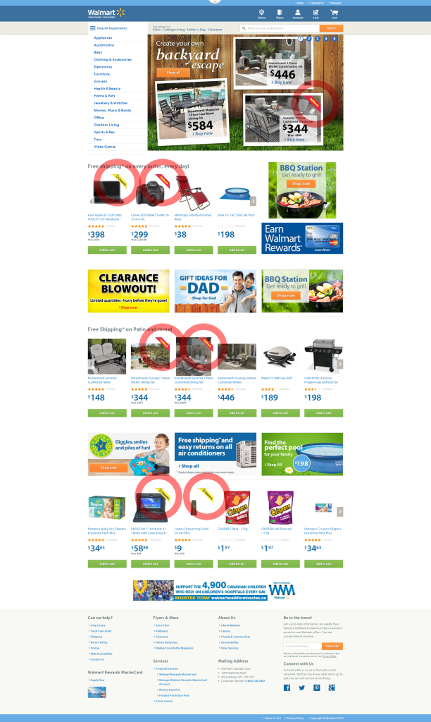
Rollback is one of Walmart’s token terms with all online and offline advertising. One glance through their stores or any of their commercials and you’ll clearly see the term used sparingly. They’ve also employed this same strategy on their website, a great way to drive added sales. Obviously not the innovators of this technique. Walmart simply knows consumer behavior in their stores and applies the same techniques to their website. Check out this example. It’s about making it obvious, We are having a promotion! This product is on Sale! Our Services are Awesome!!!
Time and time again I come across so many sites whether commerce or not that have the opportunity to have “signage” throughout their website. But neglect to take advantage of the real estate. There is a real opportunity here to get your consumer thinking about that purchase, give them a bit of a carrot.
What about the POP (Point of Purchase)
The best retailers effectively execute their POP to sell you one last thing before you’re out the door. Their displays sit staring at you at the checkout counter. Hello, here’ we are, why not take one of us home with you, and plus buy one and get another one for Free!
How many times have you grabbed that pack of gum or that chocolate bar just before placing the last of your carts items on the conveyor belt? I see a massive opportunity here online which gets neglected far too often. Play off the impulse purchase and take advantage of your point of purchase page.
Book with us
Let’s accomplish what you are looking for, our team of experts are here for you.
Let's work togetherWarning: Working with our team may result in excessive creativity, uncontrollable 'aha' moments, and an addiction to perfect pixels. Please proceed with caution.


